Internship Hubs
UX/UI Design

Overview
1. Summary
Timeline: October 2020 - March 2021
Client: Hubs
My role: UX/UI Designer
Skills: User interviews, Wire-framing, UX/UI Design, Prototyping
Tools: Sketch, Zeplin, Invision
Device: Desktop (SaaS)
In the last year of my studies I had the opportunity to work at Hubs as a Product design (UX/UI) intern. During this internship I worked in multidisciplinary teams where I was supporting the developers by creating the needed design work. Across these several months, I worked in different teams on a few projects.
2. About Hubs
Hubs started out as a network of 3D printing services, and is nowadays a platform that makes it possible for customers to order custom products from their global network of manufacturers. Hubs offers a broad range of materials using multiple manufacturing technologies, and a platform that uses machine learning to quote costs, making the overall experience efficient.
Read more about Hubs here

3. The projects
Control over finishes
The purpose of this project was to create an overview of the partners (manufacturers) of Hubs and which finishes they can perform well, since not every partner has the competences in doing so. The key here was to work on adding and removing finishes for each partner, as well as to add the right filters. All designs got implemented with the help of the team’s developer(s) and the designs were presented in Invision as a prototype.
Function 1: adding and removing finishes

When the user clicks on the 'edit' button a modal like this pops up. The user gets an overview of all the finishes.

The user can select the finishes simply by clicking on them. Another click deselects the item. Once saved, the finishes are applied to the manufacturer.
Function 2: applying filters

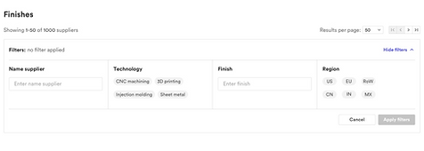
When the user clicks on 'show filters' the filter bar opens up, displaying all the filter options.

After the filter bar opens up, the user can select the filters of preference and 'apply' the filters to display more specific optios.
Showcase CNC surface finishes
The problem here was that when uploading a part, the customer could choose a finish on the product but did not know what this finish would look like. This created many situations where a customer got a part with a surface finish they did not expect and had to return the part. This example came from one of the user interviews.
When I started with the project I started following the Lo-Fi design included in the project description, but in the course of the design process this changed a lot. The toughest part of this project might have been the ‘description box’ (A description about each finish that pops open when clicked on). At the beginning of the project, the information available about each finish was inconsistent which required a lot of communication with team members

The image above shows the empty, hover and selection (aka active) state of the 'select surface finish' dropdown bar.